

Angular directives are classes that add behavior to elements in your templates, and there are three kinds: components (directives with a template), attribute directives (which change appearance or behavior, like ngClass, ngStyle, or a custom highlight directive), and structural directives (which add or remove DOM). In Angular 22 the everyday structural work — conditionals, loops, and switches — is now handled by the built-in control flow (@if, @for, @switch), which has replaced the legacy *ngIf, *ngFor, and *ngSwitch. This article shows you the modern directive model end to end: the control flow syntax, a custom attribute directive built with a signal input and host bindings, the @let template variable, and a worked example that combines a directive with a @for list.
What are the three kinds of directives?
Everything you place in an Angular template is powered by a directive:
- Components are directives with their own template. They are the most common directive you write.
- Attribute directives change the look or behavior of an existing element without adding or removing it. Built-in examples are
ngClassandngStyle; you can also write your own, such as a directive that highlights an element on hover. - Structural directives reshape the DOM by adding and removing elements. Historically these were
*ngIf,*ngFor, and*ngSwitch. In Angular 22 that job belongs to the built-in control flow, and you rarely author your own structural directive anymore.
Why did the built-in control flow replace *ngIf and *ngFor?
The legacy structural directives were real directives that shipped in CommonModule and used the * microsyntax. They worked, but they came with friction: you had to import CommonModule (or each directive) into every standalone component, the compiler parsed a small embedded language behind the *, and *ngFor without a trackBy function re-rendered entire lists on every change. Nested conditions also grew awkward — an *ngIf with an *ngElse template reference and a separate <ng-template> was verbose and easy to get wrong.
The built-in control flow is part of the Angular compiler itself. It needs no imports, ships less JavaScript to the browser, is fully type-checked inside the template, and reads like ordinary code. Because it is compiled rather than interpreted at runtime, Angular can also generate more efficient DOM updates. If you have an existing codebase, Angular ships an automatic migration that converts your templates in place:
ng generate @angular/core:control-flow
That command rewrites *ngIf, *ngFor, and *ngSwitch throughout your templates into the new blocks. New code should use the new syntax directly.
How do @if and @else work?
@if is a template block, not an attribute. It reads clearly and supports @else if and @else chains:
@if (user(); as u) {
  <p>Welcome back, {{ u.name }}</p>
} @else if (loading()) {
  <p>Loading…</p>
} @else {
  <button (click)="signIn()">Sign in</button>
}
The as u alias binds the truthy value to a local variable, which is handy when the condition is a signal call or an expensive expression — you evaluate it once and reuse the narrowed, non-null value inside the block. Because @if is a first-class block, the branches nest cleanly and TypeScript narrows types across them, so u is known to be non-null inside the first branch.
How do I loop with @for?
@for replaces *ngFor, and it makes the track expression required. Tracking tells Angular how to identify each item so it can move DOM nodes instead of recreating them:
<ul>
  @for (task of tasks(); track task.id) {
    <li>{{ task.title }}</li>
  } @empty {
    <li>No tasks yet.</li>
  }
</ul>
Two things are new and worth calling out. First, track task.id is mandatory — use a stable unique key; only fall back to track $index when items have no identity. Second, the @empty block renders when the collection is empty, replacing the old pattern of a separate @if. Inside the loop you also get contextual variables such as $index, $first, $last, $even, and $odd, which you can alias with let idx = $index when nesting loops. In the worked example below, tracking by task.id means adding a task appends a single <li> rather than re-rendering the whole list — a real performance win for large or frequently updated collections.
How does @switch work?
@switch mirrors a switch statement and needs no imports:
@switch (status()) {
  @case ('active')  { <span class="badge ok">Active</span> }
  @case ('paused')  { <span class="badge warn">Paused</span> }
  @default          { <span class="badge">Unknown</span> }
}
Cases are matched with strict equality, and @default is optional.
Writing a custom attribute directive
When you need reusable behavior on an element — not a new element — write an attribute directive. In Angular 22 you use a standalone directive with a signal input and host bindings. Here is a highlight directive that colors its host on hover:
import { Directive, ElementRef, inject, input, signal } from '@angular/core';

@Directive({
  selector: '[gaHighlight]',
  host: {
    '(mouseenter)': 'hovering.set(true)',
    '(mouseleave)': 'hovering.set(false)',
    '[style.background-color]': 'hovering() ? color() : ""',
    '[style.transition]': '"background-color .15s"',
  },
})
export class HighlightDirective {
  readonly color = input('yellow', { alias: 'gaHighlight' });
  private readonly hovering = signal(false);
  private readonly el = inject(ElementRef); // available if you need direct access
}
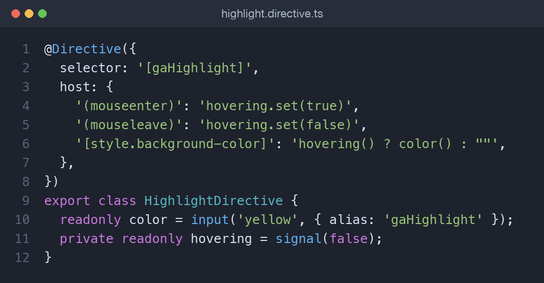
The input() function creates a signal-based input, so color() is read reactively; the alias lets you bind the value directly on the selector attribute. The host object declares event listeners and property bindings without a decorator on each member. You would use it like <p gaHighlight="lightgreen">, and because the directive is standalone you simply add HighlightDirective to a component's imports array — there is no module to register.
A few points make this the idiomatic Angular 22 approach. Using input() instead of the older @Input() decorator gives you a signal, so any template or computed that reads color() reacts automatically when the bound value changes. The host metadata object keeps every host interaction in one place, which is easier to scan than decorators scattered across class members. And injecting dependencies with inject() rather than constructor parameters keeps the class body concise and works well with signals. This same pattern scales to richer directives — form control accessors, tooltips, drag handles — without changing the fundamentals.
What is the @let template variable?
@let declares a local variable inside a template, computed once and reused. It keeps templates readable and avoids repeating an expression:
@let fullName = user().firstName + ' ' + user().lastName;
<h2>{{ fullName }}</h2>
<p>{{ fullName }} has {{ tasks().length }} tasks</p>
@let values are read-only and update automatically when the signals they read change. Unlike a component property, the variable lives entirely in the template and is scoped to it, so it is perfect for destructuring an async result or naming a repeated sub-expression without adding noise to your class.
Bringing it together: a directive plus a @for list
The worked example ties these pieces into one small component. It holds a tasks signal, renders each item with @for (task of tasks(); track task.id), shows an @empty fallback, chooses a status badge with @switch, computes a count in @let, and applies the custom gaHighlight directive to each row. Adding a task calls tasks.update(...), and thanks to track task.id only the new row is inserted. The full source lives in the companion repository referenced below, ready to drop into an Angular 22 app.
When do you still write a structural directive?
The built-in control flow covers conditionals, loops, and switches, so most apps never author a custom structural directive again. You still might when you need a genuinely reusable DOM-shaping abstraction — for example a permission gate (*appHasRole) or a directive that stamps a template into a portal or a virtual scroll viewport. In those cases you inject TemplateRef and ViewContainerRef and call createEmbeddedView to instantiate the template, adding or removing the embedded view as your logic dictates. That is genuinely different from a conditional: you are packaging DOM-manipulation logic to be reused across many templates. For anything that simply toggles or repeats content in a single template, reach for @if and @for instead — they are shorter, faster, and need no supporting class.
Key takeaways
- Directives come in three kinds: components, attribute directives, and structural directives.
- Angular 22's built-in
@if,@for, and@switchreplace*ngIf,*ngFor, and*ngSwitch; migrate withng generate @angular/core:control-flow. @forrequires atrackexpression and supports an@emptyblock for the no-items case.- Write custom attribute directives with
input()signal inputs and thehostmetadata for bindings and listeners. @letdeclares reusable, reactive template variables.- Custom structural directives are now rare — use them only for real DOM-shaping abstractions.
Frequently asked questions
Do I still need to import CommonModule for control flow?
No. @if, @for, and @switch are built into the framework and need no import. You only import CommonModule for pipes or directives like ngClass that still live there.
Is the track expression in @for really required?
Yes. Angular 22 requires a track expression on every @for. Use a stable unique key such as item.id; use $index only when items have no natural identity.
Are the legacy *ngIf and *ngFor removed in Angular 22?
They are deprecated and strongly discouraged, but the migration schematic converts existing code automatically. New code should use the built-in control flow exclusively.
What is the difference between an attribute and a structural directive?
An attribute directive changes an existing element's appearance or behavior, while a structural directive adds or removes elements from the DOM. Control flow blocks now handle most structural work.
Comments (0)
No comments yet — be the first to share your thoughts.